Nicolai · Motion designer & creative developer, Copenhagen

Skip to content

Nicolai · Motion designer & creative developer, Copenhagen

Nicolai is a motion graphics designer and creative developer based in Copenhagen, building campaign motion, HTML5 banners and interactive websites.

  1. Hi, I'm Nicolai

    Nicolai talking to camera, introducing his portfolio and showing how the feed works.

    Hi. You're scrolling my portfolio. I'm Nicolai, and I make things move.
    212 likes

    • work
    • nicolaiOP

      How the intro works: the video and the site share a timeline. When I mention a feature, the real button on your screen lights up. The desktop gets its own 16:9 cut, timed to the desk.

    • nicolaiOP

      This is a feed of my work: campaigns, banners, stage screens and websites. Swipe up for the next one, and sideways where a post has more than one cut. It ends when you've seen everything.
  2. Falkoner Salen · Store oplevelser siden 1958

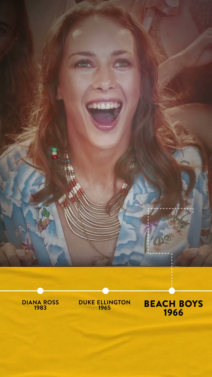
    Vertical spot: a woman with long curly hair sticks her tongue out at a concert while a yellow timeline along the bottom ticks through the 60s and 70s acts that played Falkoner Salen (Bee Gees 1968, KISS 1976, ABBA 1979), each tied to a dotted focus box on the crowd.

    I'm Nicolai. I make things move.
    Three decades of Falkoner Salen, and the great musicians who played there that nobody remembers.

    184 likes

    • work
    • campaigns

    Also delivered

    Client
    Falkoner Salen
    Project
    Store oplevelser siden 1958
    Year
    2022
    Made at
    SeLigeMig
    Role
    Motion design, Edit
    Tools
    After Effects, Premiere Pro
    Export
    H.264 · 9:16 · 15 s
    • nicolaiOP

      Tech breakdown: 3 × 15 s at 9:16, live action with a 2D tracking layer (focus boxes pinned to faces) and a type-driven timeline. The three decades play one after the other here; swipe to jump.

    • nicolaiOP

      Made with SeLigeMig, as part of an initiative to put the spotlight back on the great musicians who played Falkoner Salen and that almost nobody remembers. Three spots, one per era (60s–70s, 80s–90s, 00s–10s), 15 seconds each, vertical first.

    • nicolaiOP

      The timeline is the idea. Every act that played the hall sits on a strip along the bottom, and a dotted focus box links the name to a reaction in the crowd, so the history reads as memories, not a list.

      • nicolaiOP

        The strip is also the format system: same position, same type, same rhythm in all three decades. Swap the footage and the names, and the spot still works.

  3. SkyShowtime · The Yellowstone saga

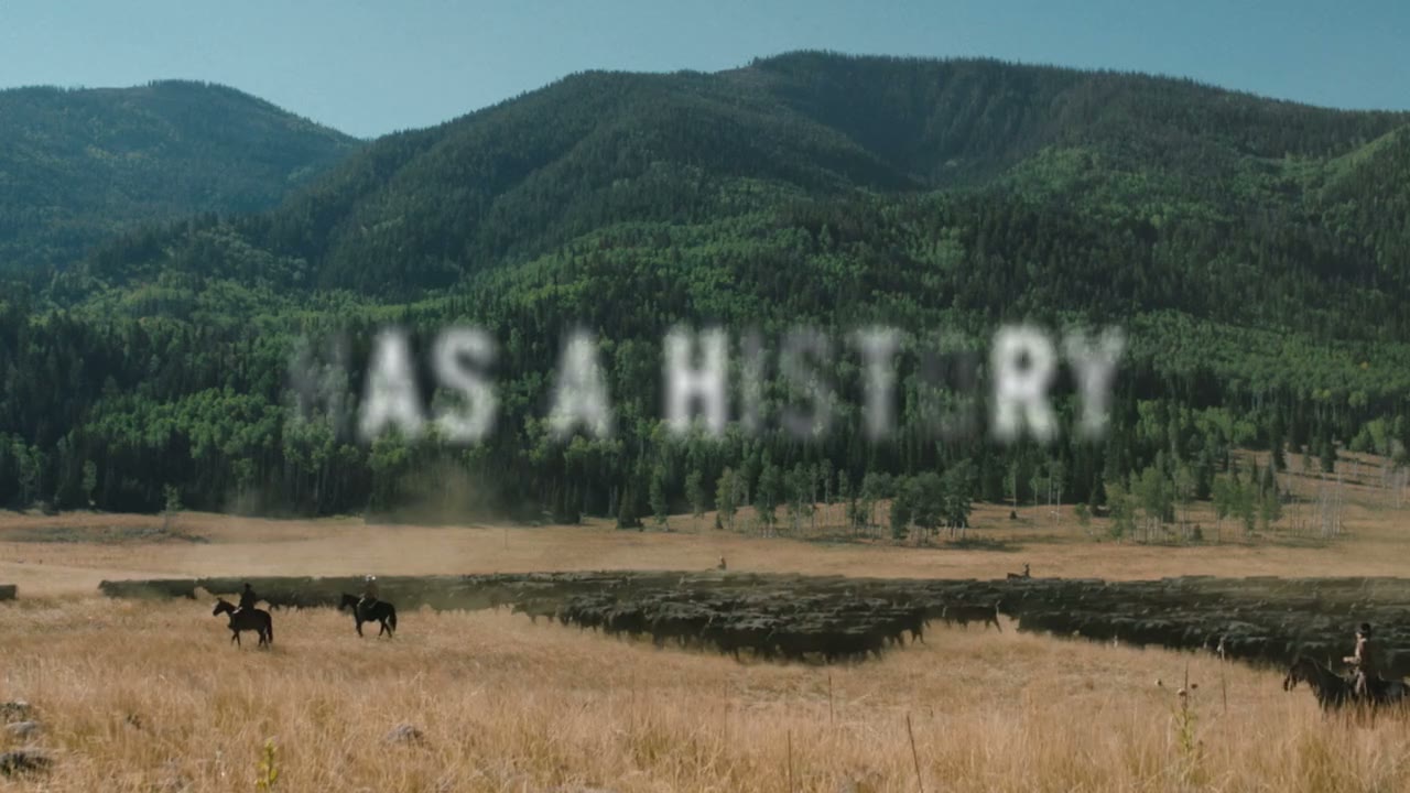
    Widescreen spot for the Yellowstone saga on SkyShowtime: ranch landscapes and close-ups of the Dutton family with subtitled dialogue, and the line "Every family has a history" set in large condensed type over a valley of riders.

    Every family has a history. The work I've spent the most time on: the Yellowstone saga on SkyShowtime, versioned into 12 to 16 languages across Europe.

    231 likes

    • work
    • campaigns
    Watch the full film (0:30)

    Also delivered

    Client
    SkyShowtime
    Project
    Yellowstone saga
    Year
    2025
    Made at
    XO 360°
    Role
    Edit, Motion design, Versioning
    Tools
    Premiere Pro, After Effects
    Markets
    Albania, Bosnia and Herzegovina, Bulgaria, Czechia, Denmark, English, Spain, Finland, Croatia, Hungary, North Macedonia, Netherlands, Norway, Poland, Portugal, Romania, Serbia, Sweden, Slovakia, Slovenia
    Export
    H.264 · 16:9 · 2.1 MB
    • nicolaiOP

      The real job was the versioning: every spot went out in 12 to 16 languages across Europe, dubbed mainly for Hungary and Spain, with local type, legal lines and prices on every end card, for twenty markets in all.

    • nicolaiOP

      Made at XO 360°, and the project I've spent the most time on. The brief: make the whole saga (Yellowstone, 1883, 1923) feel like one family story, and land the price. Thirty seconds, then cut down and reworked for every placement.

    • nicolaiOP

      The line does the heavy lifting: "Every family has a history" builds across the edit, one phrase per scene, so the type carries the story between the dialogue lines.

      • nicolaiOP

        Same system, many outputs: Fire, Perspective and Enemies as 30 and 15 s AV, character spots for Beth and John, and Legacy, Wind and a price spot for Denmark with Danish subtitles and "Kun 69 kr./md." on the end card.

  4. FitnessX · Det er OK

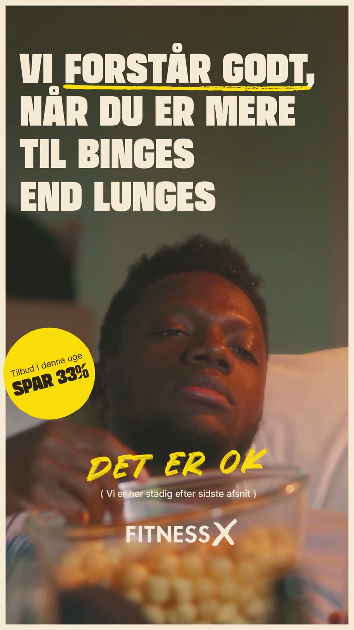
    Vertical FitnessX ad: a man eats popcorn on the sofa under bold white type, "Vi forstår godt, når du er mere til binges end lunges", then "Det er OK" lands in yellow handwriting with a "Spar 33%" sticker and the FitnessX logo.

    A gym campaign that doesn't shame anyone. Binges over lunges? Det er OK. Seven excuses, one answer.

    142 likes

    • work
    • campaigns
    • banners

    Also delivered

    Client
    FitnessX
    Project
    Det er OK
    Year
    2025
    Made at
    XO 360°
    Role
    Motion design, Versioning
    Tools
    After Effects
    Export
    H.264 · 9:16 · 1.0 MB
    • nicolaiOP

      Tech breakdown: one kinetic-type template in After Effects. Seven 10 s spots at 1080×1920 with the footage, headline and sticker swapped per excuse. They play one after the other here; swipe to jump.

    • nicolaiOP

      A new campaign for FitnessX, made at XO 360°. The brief: a gym campaign that doesn't make anyone feel bad. Every spot names a real excuse, from binge-watching and exams to football, New Year's parties, upvotes and streaks, and answers it with "Det er OK". Then the offer.

    • nicolaiOP

      The type does the acting. The excuse reads like a headline, "Det er OK" arrives like a handwritten shrug, and the discount sticker always comes last so the joke lands before the sale.

      • nicolaiOP

        Being a new campaign, it had to live everywhere at once: every spot was versioned for a range of platforms, with the excuse, the answer and the sticker re-timed and re-placed for each one.

  5. Apopro · Black Week

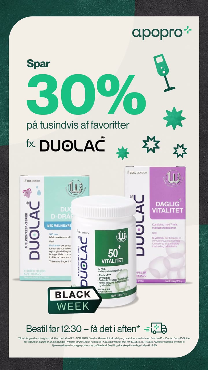
    Vertical Apopro Black Week ad: two Duolac packs swing in one after the other on a cream card, then the offer lands, "Spar 30% på tusindvis af favoritter", with a Black Week badge and the evening-delivery line.

    Black Week for an online pharmacy. One master template, seven product ranges, and as many versions as the week needs.

    97 likes

    • work
    • campaigns
    • banners

    Also delivered

    Client
    Apopro
    Project
    Black Week
    Year
    2025
    Made at
    XO 360°
    Role
    Motion design, Versioning
    Tools
    After Effects
    Export
    H.264 · 9:16 · 1.42 MB
    • nicolaiOP

      Tech breakdown: one master comp at 2160×3840, products and copy driven as swappable layers, 10 s at 25 fps per spot. They play one after the other here; swipe to jump.

    • nicolaiOP

      Made at XO 360°. The brief: Black Week for an online pharmacy. Seven product families, from probiotics and skincare to vitamins for kids, each with its own spot and the same promise: up to 40% off, delivered tonight.

    • nicolaiOP

      This is what master templates are for: variety, fast. Design the system once, not seven ads. Hero pack in, second pack in, then the offer card with all of them, the badge and the delivery line. Every spot runs that exact rhythm with a different range in it.

      • nicolaiOP

        The offer card is the template's real job: the headline, the percentage and the packshot sizes change per range, and the layout has to hold whether it's two jars or five tubes.

  6. Rekom · Raise the bar

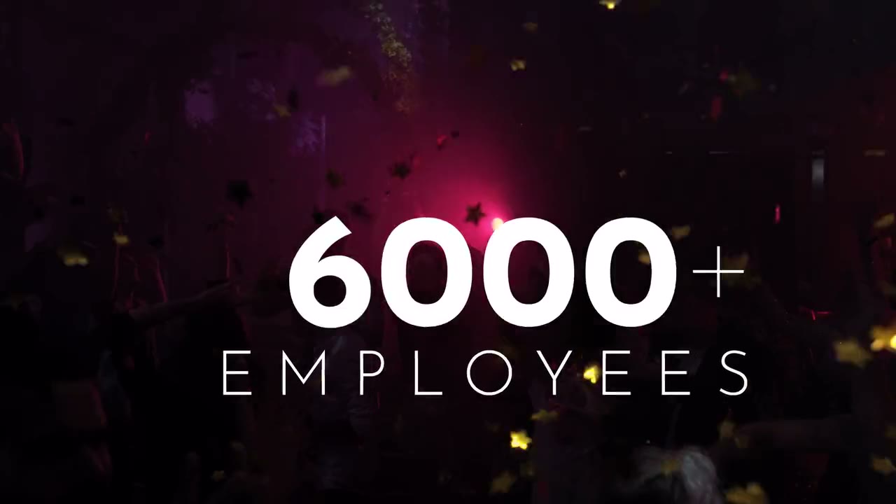
    Widescreen film for Rekom: a packed nightclub under confetti and lights while thin white numerals count employees per country (United Kingdom, Norway) up to "6000+ employees".

    Employer branding for the Nordics' biggest nightlife group. I made the motion-graphics overlay: numbers that count up with the room.

    118 likes

    • work
    Watch the full film (1:21)

    Also delivered

    Client
    Rekom
    Project
    Raise the bar
    Year
    2022
    Made at
    SeLigeMig
    Role
    Motion graphics overlay
    Tools
    After Effects
    Export
    H.264 · 16:9 · 2.56 MB
    • nicolaiOP

      Tech breakdown: 2D data-graphics layer over live-action plates: counters, map callouts and hairline leaders pinned to the footage. 1080p, 25 fps. Main film (1:21) plays in full below.

    • nicolaiOP

      Made with SeLigeMig: three internal employer-branding films for Rekom (the group story, careers and cases) where the scale of the business is the message. 105 venues, 6000+ employees, four countries. My part was the motion-graphics overlay on top of the films.

    • nicolaiOP

      The graphics had to feel like part of the night, not a slide deck: thin type, hairline maps, numbers that tick up in sync with the crowd and then get out of the way.

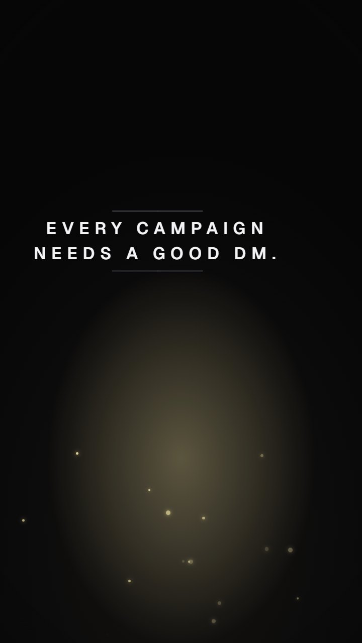
  7. Every campaign needs a good DM

    A candlelit tabletop game: Nicolai as the dungeon master behind his screen, a twenty-sided die rolling across a map of ad formats.

    Every campaign needs a good DM. Roll for initiative.

    164 likes

    • work
    • nicolaiOP

      Why am I seeing this ad? Because you're looking at a portfolio, and the person who made it would like to work with you.

    • nicolaiOP

      The concept: I've been the dungeon master of my D&D group for years, and this site's contact form is a DM. The ad wrote itself.

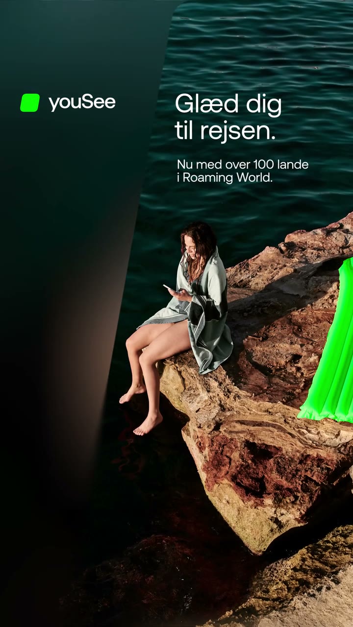
  8. YouSee · Glæd dig til rejsen

    Vertical YouSee ad: a woman reads on sun-warmed rocks by dark green water, a bright green inflatable at the edge of frame, as "Glæd dig til rejsen" fades in beside the YouSee logo before a blur transition to the end card.

    Roaming in 100+ countries, sold in twelve quiet seconds. Swipe for the phone launches built on the same system.

    103 likes

    • work
    • campaigns
    • banners

    Also delivered

    Client
    YouSee
    Project
    Roaming World + phone launches
    Year
    2026
    Made at
    XO 360°
    Role
    Motion design
    Tools
    After Effects
    Export
    H.264 · 9:16 · 1.93 MB
    • nicolaiOP

      Tech breakdown: roaming spots at 12 s in 9:16, a soft gradient wipe for the copy and a blur-through to the end card. Phone spots at 6 to 15 s in 9:16 and 16:9, delivered up to 4K: this feed shows the 9:16 cuts on phones and the 16:9 cuts on the desktop.

    • nicolaiOP

      Made at XO 360°. The biggest learning: rebuilding YouSee's motion language from scratch, so every spot moves like the brand. The brief: tell people their plan now works in 100+ countries, in a feed full of loud telco ads. We went the other way: one calm image, one line, the brand's green doing the work. Klippe and Rullebånd are two takes on the same trip.

    • nicolaiOP

      Same brand system, different job: the phone spots. iPhone 17e as a trade-in offer, Google Pixel 11 Pro and Samsung Galaxy Z Fold as launches. Device, price, badge, logo, built so a new phone is a swap, not a rebuild.

      • nicolaiOP

        Every one ends on the same beat: the green tile slides in, the logo settles. Six seconds or fifteen, it's the brand's signature either way.

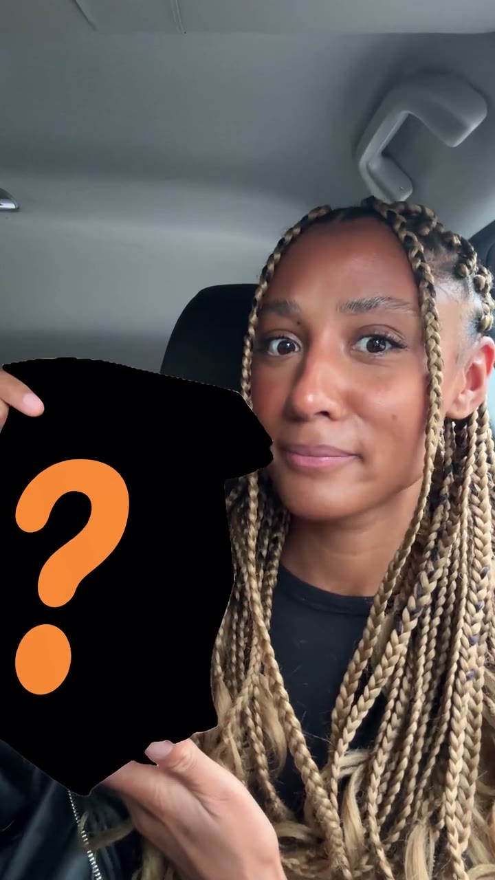
  9. Burger King · Crispy chicken, creator cut

    Vertical creator video for Burger King: a woman in a parked car hides the bag behind a black question-mark card, reveals it and takes a bite of a crispy chicken burger, with orange Burger King-style type popping in around her.

    A social video for Burger King Sweden, built to go viral. A mystery bag, a first bite, a 10/10.

    156 likes

    • work
    • campaigns
    Watch the full film (0:47)
    Client
    Burger King
    Project
    Crispy chicken
    Year
    2026
    Made at
    XO 360°
    Role
    Edit, Motion graphics
    Tools
    Premiere Pro, After Effects
    Export
    H.264 · 9:16 · 2.65 MB
    • nicolaiOP

      Tech breakdown: 9:16 at 24 fps from phone footage, edit and type animation, 46 s downcut plus shorter versions. The full cut plays below, sound on.

    • nicolaiOP

      Made at XO 360° for Burger King in Sweden: a social video meant to go viral. The fun part was designing motion graphics for that kind of video: they have to add to the creator's footage without making it look like an ad. So the talking-to-camera, the car and the honest first bite stay front and centre.

    • nicolaiOP

      Graphics stay in the brand's voice but out of the creator's face: orange type for the product claims, a single "10/10" moment, and the reveal gag at the top to earn the next five seconds.

  10. SkyShowtime · Key art in motion

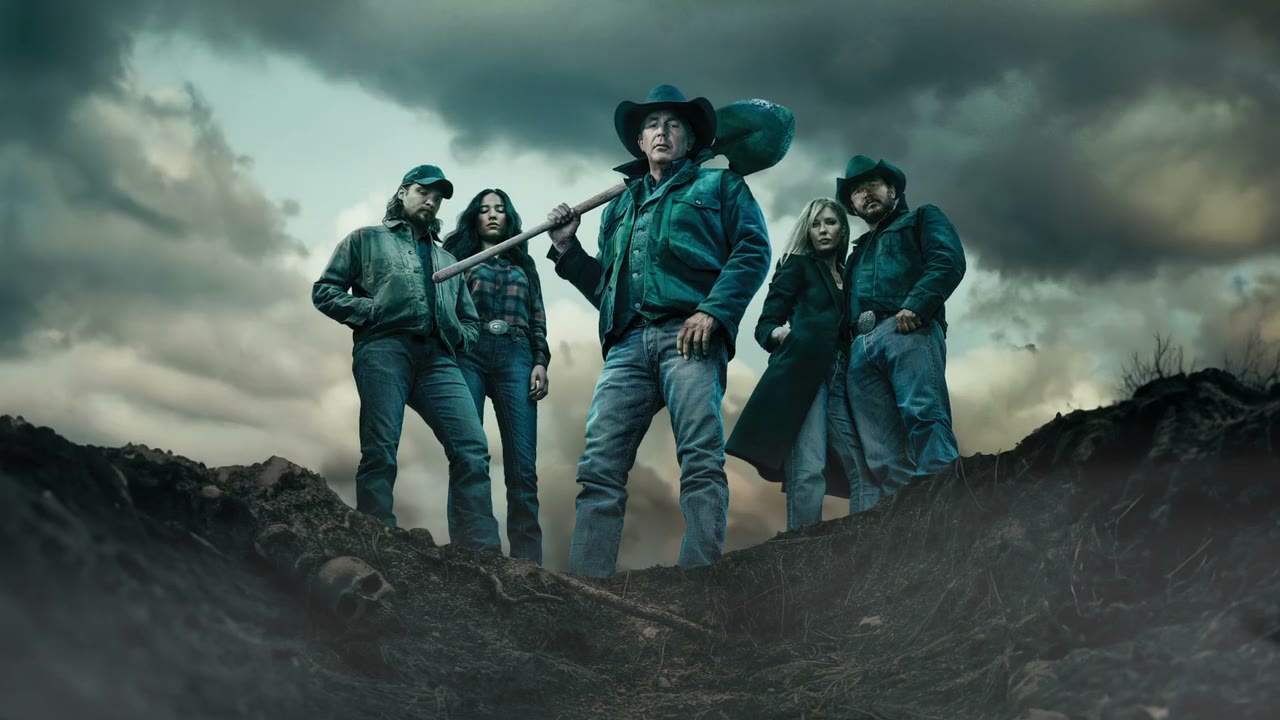
    Widescreen animated key art: the Dutton family stands on a dark ridge over an open grave, one holding a shovel, while storm clouds roll slowly across the sky behind them.

    Completely still images, brought to life. Yellowstone key art turned into living loops for DOOH and the web, seen all over the internet at the time.

    88 likes

    • process
    • campaigns

    Also delivered

    Client
    SkyShowtime
    Project
    Yellowstone key art
    Year
    2025
    Made at
    XO 360°
    Role
    Motion design
    Tools
    After Effects
    Export
    H.264 · 16:9 · 1.8 MB
    • nicolaiOP

      Tech breakdown: layered key art rebuilt in 2.5D, animated atmosphere, 10 s seamless loops at 1080p. Grave, Ranch, Living room and the DOOH master play one after the other here.

    • nicolaiOP

      Made at XO 360°, and the case for taking a completely still image and making it alive. The key art already existed; the job was to make it move for digital out-of-home screens and the web, where a still looks dead, without it turning into a trailer. They ran all over the internet at the time.

    • nicolaiOP

      Rule I kept: nothing the photographer lit gets touched. The motion lives in what's around the cast (sky, fog, dust, a slow push), so the art still reads as the poster.

      • nicolaiOP

        The DOOH master puts it to work: the living-room art on one side, "Family, power and betrayal", all five seasons and the price on the other.

  11. Grøn Omstilling · explainer

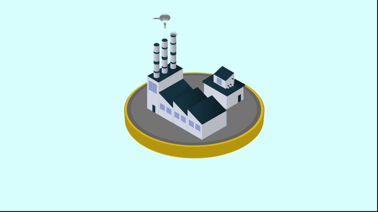
    Isometric animation: a Danish 20-krone coin spins into a platform, a small house appears on it, then a smoking factory whose smog turns the pale blue sky grey.

    Where it started: a student assignment, made from scratch. The green transition, told on one coin.

    74 likes

    • work
    Watch the full film (1:13)
    Project
    Grøn Omstilling
    Year
    2019
    Made at
    UC Syd, student work
    Role
    Motion design, Illustration
    Tools
    After Effects, Illustrator
    Export
    H.264 · 16:9 · 0.22 MB
    • nicolaiOP

      Tech breakdown: flat isometric illustration, animated in 2D with shape layers, 1080p at 29.97 fps, 1:13. Full film below, sound on.

    • nicolaiOP

      One of the oldest things I have: a student assignment at UC Syd, made from scratch, and my introduction to After Effects and to using Illustrator as a way of making art, not just layouts. The brief: explain why the green transition is an economic question, not just a climate one, in about a minute.

    • nicolaiOP

      The coin is the whole idea: it's the stage everything stands on. Industry grows on it, the weather hits it, and in the end it's the battery the wind turbines charge.

  12. Toms · Husk julehyggen

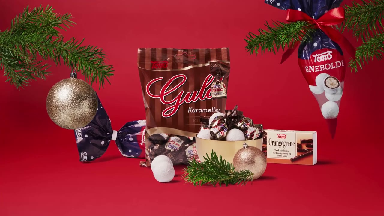
    Red Christmas TV spot for Toms: advent-calendar numbers float in snow, door 24 opens onto a festive packshot of Guld Karameller, Ris Kugler and Flødeboller between baubles and pine, and the Toms logo closes on "Husk julehyggen".

    A Christmas campaign for Toms, made from scratch. Ten seconds of TV, two packshots and a handmade feel.

    129 likes

    • work
    • campaigns
    Client
    Toms
    Project
    Husk julehyggen
    Year
    2020
    Made at
    Fireball
    Role
    Motion design
    Tools
    After Effects
    Export
    H.264 · 16:9 · 1.85 MB
    • nicolaiOP

      Tech breakdown: After Effects expressions switch between the two packshots on a beat while the position animates smoothly underneath, so it feels handmade, almost stop-motion, without a frame of hand-keying. 16:9 at 25 fps, delivered in 4K for TV2. Unmute for the full spot.

    • nicolaiOP

      A Christmas campaign I made at Fireball, from scratch: a 10-second TV2 spot that says Christmas and Toms before the viewer reaches for the remote. A professional photographer shot the product, two packshots of it.

    • nicolaiOP

      The advent calendar does both jobs: door 24 is the most Christmas thing there is, and opening it is a natural reveal for the packshot. Then the same door motion wipes to the logo.

  13. Ask your art director

    A soft-lit lifestyle-ad parody: Nicolai on a park bench with coffee, then standing on a rotating product pedestal under the line "Motion, everywhere."

    Forty-seven formats due by Friday? Ask your art director if Nicolai is right for you.

    139 likes

    • work
    • nicolaiOP

      Why am I seeing this ad? Because you're looking at a portfolio, and the person who made it would like to work with you.

    • nicolaiOP

      The side effects are real. Smoother easing, on-time delivery and fewer revision rounds have all been reported.

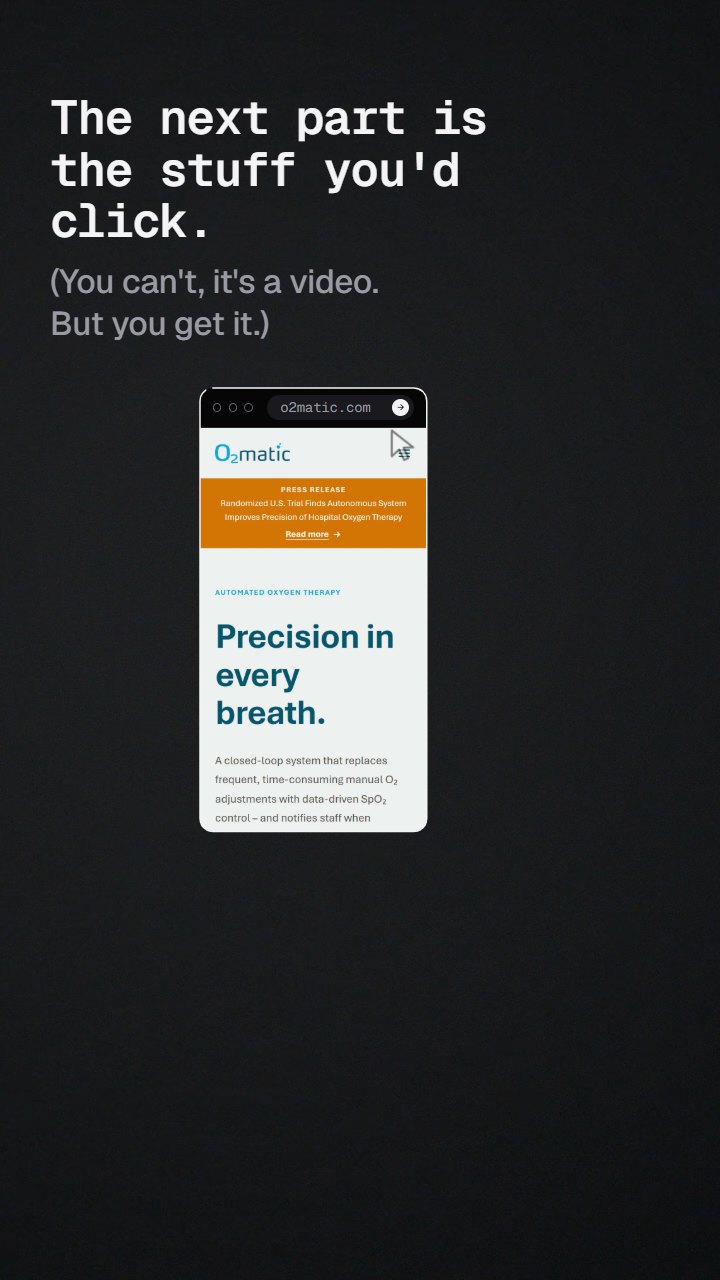
  14. Now the part you can click

    Nicolai holds a phone toward the camera; its screen opens out into a browser window showing a website he built.

    Everything so far lived inside a phone. The next part you can click.

    97 likes

    • work
    • nicolaiOP

      Why am I seeing this ad? Because you're looking at a portfolio, and the person who made it would like to work with you.

    • nicolaiOP

      The hinge of the feed: motion work above, websites below. Designed, built and animated by me.

  15. O2matic · website

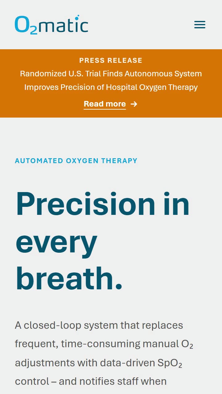
    O2matic's mobile website scrolling: the headline "Precision in every breath." in deep teal on pale grey, then a close-up of the device's screen and the sections below.

    Not only feeds. Websites too. My favourite: o2matic.com, for a closed-loop oxygen system in clinical use. "Precision in every breath" is mine too.

    96 likes

    • work
    • web
    Visit o2matic.com

    Also delivered

    Client
    O2matic
    Project
    o2matic.com
    Year
    2026
    Made at
    XO 360°
    Role
    Design, Development, CMS, Copy
    Tools
    Next.js, Tailwind CSS, Sanity
    Export
    H.264 · 9:16 · 2.19 MB
    • nicolaiOP

      Tech breakdown: Next.js (App Router) + Tailwind CSS + Sanity, hosted on Railway. Largest contentful paint around 0.3 s on a desktop connection. The headline is the LCP, not a hero image.

    • nicolaiOP

      O2matic makes an automated oxygen system: it reads a patient's SpO₂ and adjusts the oxygen flow itself. Medtech, so the site has to be calm, exact and believable before it's anything else.

    • nicolaiOP

      Made at XO 360°, and my favourite website. It runs on a comprehensive Sanity CMS, and because it's healthcare, every page had to follow the regulatory rules for how a medical device may be presented online. The motion stays quiet on purpose: nobody wants a bouncy hospital device.

    • nicolaiOP

      The site is about what O2matic actually does, not what medtech sites usually say. The line "Precision in every breath" came out of that too; I wrote it.

  16. Heliac · website

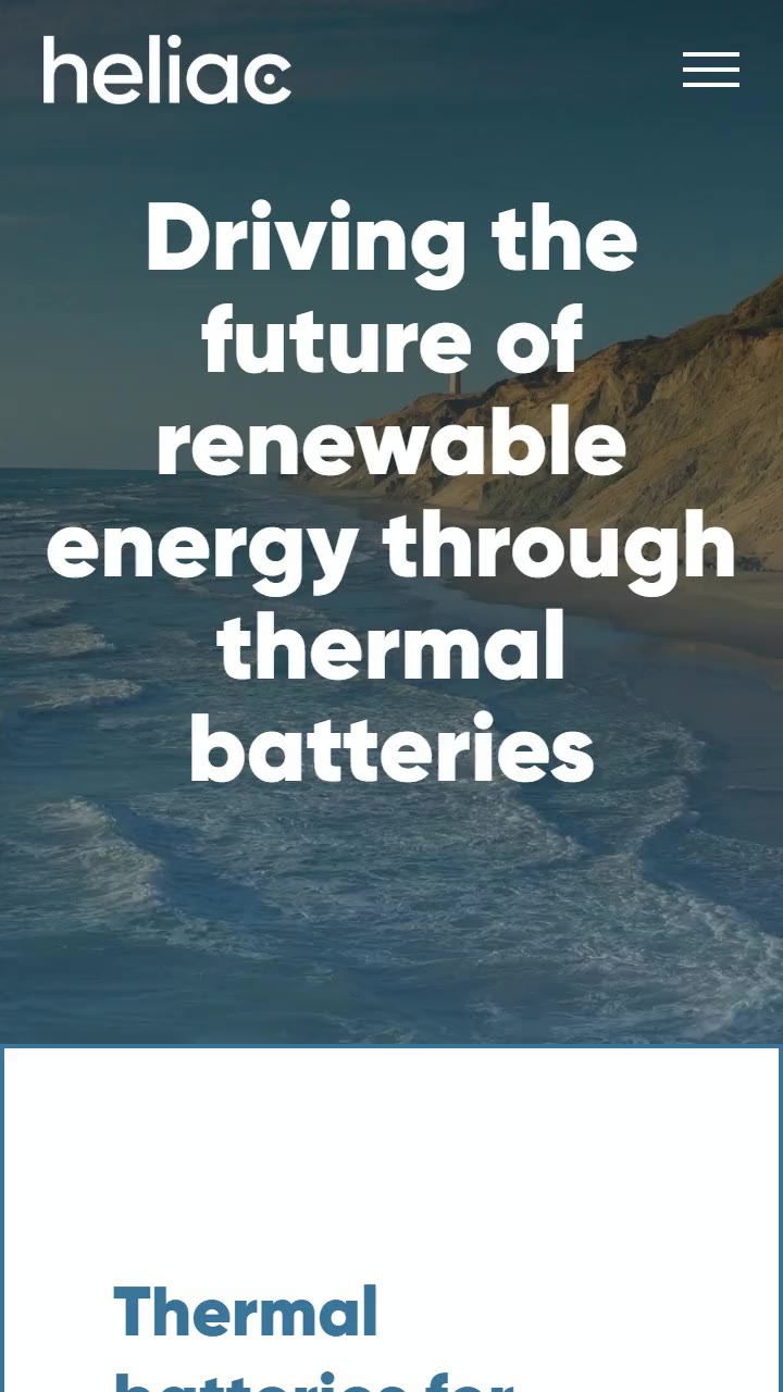
    Heliac's mobile website scrolling: "Driving the future of renewable energy through thermal batteries" in white over a coastline at dusk, then white content cards below.

    No budget for a new website? Overhaul the one you have. Heliac's WordPress site, rebuilt in Elementor to stay modern.

    88 likes

    • work
    • web
    Visit heliac.dk

    Also delivered

    Client
    Heliac
    Project
    heliac.dk
    Year
    2023
    Made at
    XO 360°
    Role
    Redesign, Development, Motion
    Tools
    WordPress, Elementor Pro
    Export
    H.264 · 9:16 · 2.96 MB
    • nicolaiOP

      Tech breakdown: WordPress + Elementor Pro, the hello-elementor base theme. The hero is a full-bleed background video of the coast.

    • nicolaiOP

      Heliac builds thermal batteries: CO₂-free heat for industry and district heating. Hard to photograph, so the site leans on landscape and light, the thing the technology runs on.

    • nicolaiOP

      Made at XO 360°. Heliac didn't have the budget for a completely new website, so we took the existing WordPress site and overhauled it in Elementor to keep it modern: build on what's already there instead of starting over. The team still publishes news and projects themselves.

  17. Born · saeddonor.com

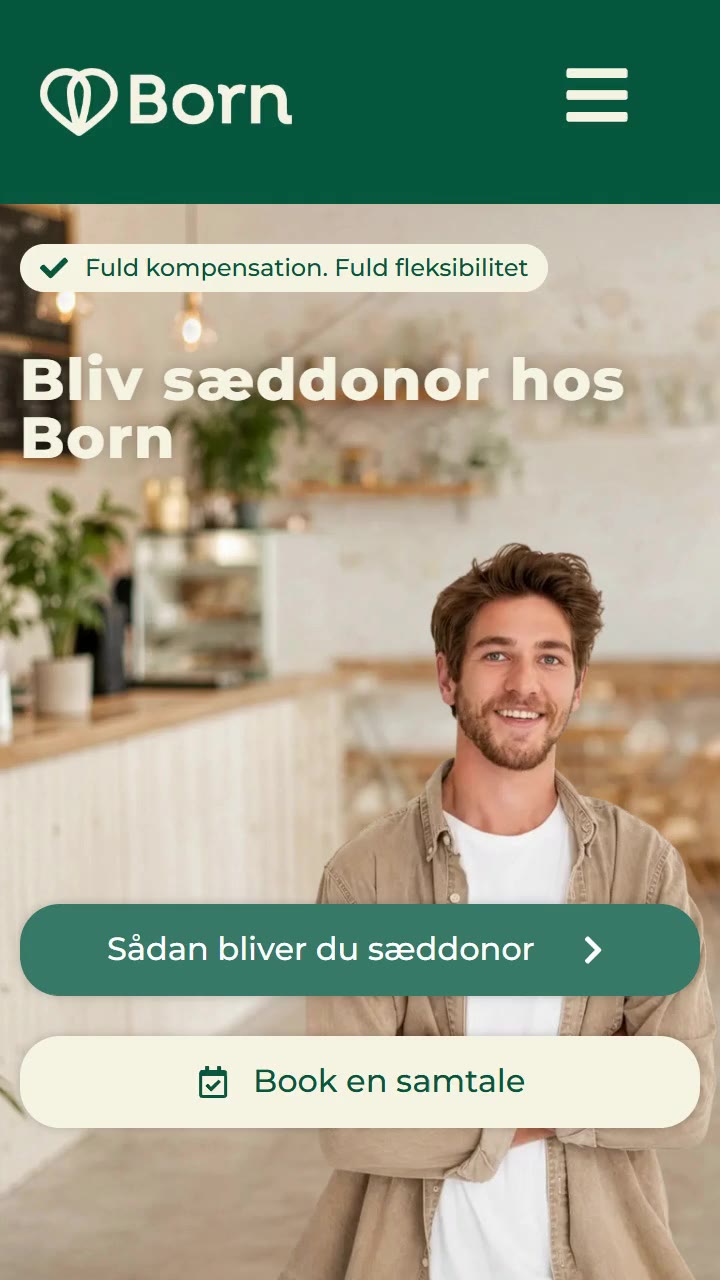
    Born's mobile website scrolling: the headline "Bliv sæddonor hos Born" over a smiling young man, green buttons to book a talk, then sections on compensation, family limits and a map of Born's clinics.

    A sperm bank's recruitment site: plain answers to a big question, built and animated for Born.

    74 likes

    • work
    • web
    Visit saeddonor.com

    Also delivered

    Client
    Born
    Project
    saeddonor.com
    Year
    2025
    Made at
    XO 360°
    Role
    Development, Motion
    Tools
    WordPress, Elementor Pro
    Export
    H.264 · 9:16 · 2.86 MB
    • nicolaiOP

      Tech breakdown: WordPress + Elementor Pro, with a fixed header and the motion built into the page sections. Recorded on its own mobile and desktop breakpoints.

    • nicolaiOP

      Born is a sperm bank with clinics across Denmark, and saeddonor.com is where they find new donors. A big decision for anyone reading, so the site has to be warm, open and completely clear about what it involves: the talks, the health checks, the compensation.

    • nicolaiOP

      Made at XO 360°. I built the site and its motion from the agency's design: the donor journey in three steps, the reasons to donate, the family limits and a map of every clinic, so a reader can go from curious to booking a talk without a single question left over.

  18. XO 360 · website build

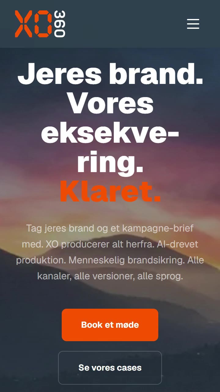
    XO 360's mobile website scrolling: "Jeres brand. Vores eksekvering. Klaret." in white and orange over a misty mountain range, then the agency's key numbers.

    xo.dk, my employer's site. I didn't design it; I built the CMS and the motion language: intros, outros and a smooth transition on every page.

    71 likes

    • process
    • web
    Visit xo.dk

    Also delivered

    Client
    XO 360° Graphics
    Project
    xo.dk
    Year
    2026
    Made at
    XO 360°
    Role
    Development, CMS, Motion language
    Tools
    Next.js, Tailwind CSS, Lenis
    Export
    H.264 · 9:16 · 2.11 MB
    • nicolaiOP

      Tech breakdown: Next.js (App Router) + Tailwind CSS behind Cloudflare, Lenis smooth scrolling, Danish and English. Largest contentful paint around 0.5 s.

    • nicolaiOP

      The studio I work at. Honest credit: the visual design isn't mine. What is: every line of the build, the motion language, and the CMS.

    • nicolaiOP

      The CMS was the real brief. XO ships work constantly, so adding a case had to be something anyone in the office can do in minutes, with no developer in the loop.

    • nicolaiOP

      The motion language is the part I'm proudest of: every page has an intro and an outro, and moving between pages is one smooth transition instead of a reload. It gives the design its timing: how sections arrive, how numbers count, how scrolling feels.

  19. Lord of the Craft · website

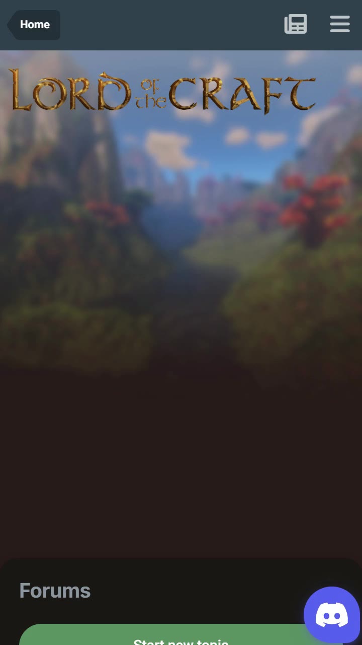
    Lord of the Craft's forums on mobile, scrolling: the gilded "Lord of the Craft" logotype over a painted fantasy landscape, then forum categories under bronze headers (Off Topic, Archives) and the latest topics.

    The home of a Minecraft roleplay world running since 2011. I designed and built the theme for its forums, lore and nations.

    81 likes

    • work
    • web
    Visit lordofthecraft.net/forums

    Also delivered

    Client
    Lord of the Craft
    Project
    lordofthecraft.net
    Year
    2023
    Role
    Design, Development
    Tools
    HTML5, CSS, JavaScript
    Export
    H.264 · 9:16 · 2.46 MB
    • nicolaiOP

      Tech breakdown: a custom theme for Invision Community: templates, CSS and the navigation for forums, lore, rules and the map. Recorded on its own mobile and desktop breakpoints.

    • nicolaiOP

      Lord of the Craft is a medieval fantasy roleplay server on Minecraft, running since 2011: nations, magic, a whitelist and a forum where the world's history gets written. The forum is the game's other half.

    • nicolaiOP

      I designed and built the theme. The brief was the world itself: a painted landscape behind everything, a gilded logotype, bronze tabs for the sections, and a dark page that still reads well through long threads of lore.

  20. Skyborn · Leadership Forum 2026

    Ultra-wide stage graphic in pale sky blues: a wind turbine turns behind two slanted blue panels while the title "Leadership Forum 2026" sits to the left.

    Graphics for a screen four times wider than it is tall. Stage visuals for Skyborn's Leadership Forum.

    67 likes

    • work
    Watch the full film (3:08)

    Also delivered

    Client
    Skyborn
    Project
    Leadership Forum 2026
    Year
    2026
    Made at
    XO 360°
    Role
    Motion design
    Tools
    After Effects
    Export
    H.264 · 4:1 · 0.31 MB
    • nicolaiOP

      Tech breakdown: 3520×880 at 25 fps. Two intros (3:08 and 1:10) and a background loop. The full opener plays below.

    • nicolaiOP

      Made at XO 360° for an event: visuals for the Leadership Forum's stage screen. An opener, plus loops that can hold the room between speakers without pulling focus from them.

    • nicolaiOP

      A 4:1 canvas changes everything: nothing can sit in the middle (that's where the speaker stands), so the composition lives at the edges and the motion moves slowly across.

  21. You've reached the end

    Nicolai on a sofa with a coffee, closing the feed and inviting a message.

    You've reached the end. No algorithm here.

    188 likes

    • work
    • banners
    • campaigns
    • process
    • opinions
    • web
    • nicolaiOP

      That's everything. If something in here is what your next project needs, send me a message. It really is me on the other end.